In today’s digital age, mobile devices have become a primary tool for online shopping. To capitalize on this trend, businesses must ensure their websites are optimized for mobile sales. A mobile-optimized website enhances user experience, boosts search engine rankings, and ultimately drives more conversions. Here are key strategies to optimize your website for mobile sales effectively.
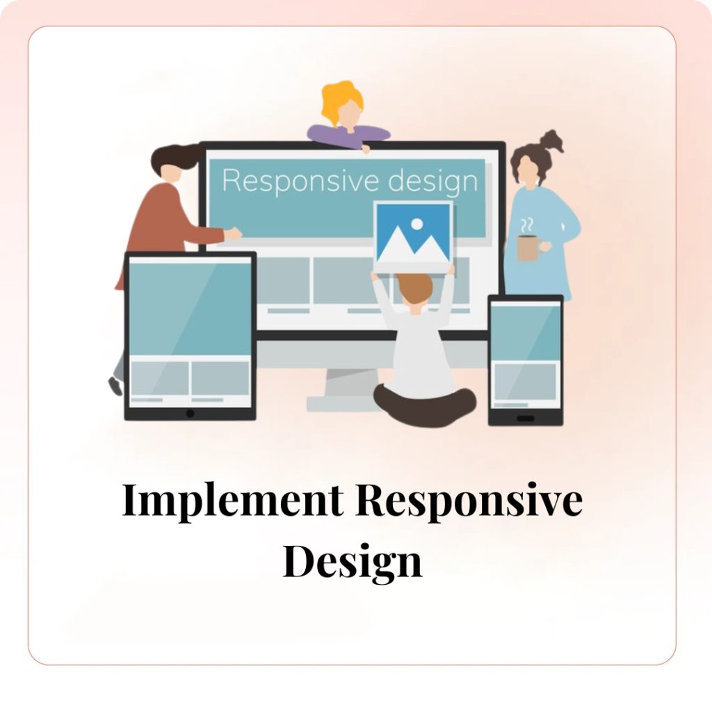
1. Implement Responsive Design
Responsive design ensures that your website adapts seamlessly to different screen sizes and devices. This approach provides a consistent and user-friendly experience, whether customers are browsing on a smartphone, tablet, or desktop. Use flexible grids, scalable images, and CSS media queries to create a website that looks and functions well on any device.
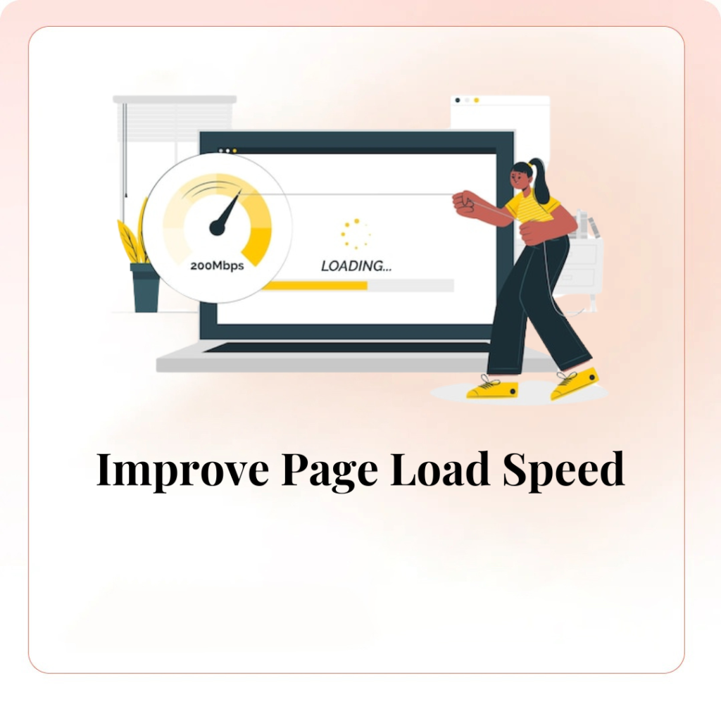
2. Improve Page Load Speed
Mobile users expect fast-loading pages. A slow website can lead to high bounce rates and lost sales opportunities. Optimize your website’s speed by compressing images, leveraging browser caching, minimizing HTTP requests, and using content delivery networks (CDNs). Tools like Google PageSpeed Insights can help identify areas for improvement.
3. Simplify Navigation
Mobile users need easy and intuitive navigation to find what they’re looking for quickly. Use a simple, clean layout with a clear menu structure. Implement a sticky navigation bar that remains visible as users scroll. Include a prominent search bar to help users locate products or information swiftly.
4. Optimize for Touch Interactions
Ensure your website is easy to navigate with touch gestures. Buttons and links should be large enough to tap easily without zooming in. Avoid placing clickable elements too close together to prevent accidental clicks. Use touch-friendly design elements like swipeable image galleries and dropdown menus that work smoothly on touchscreens.
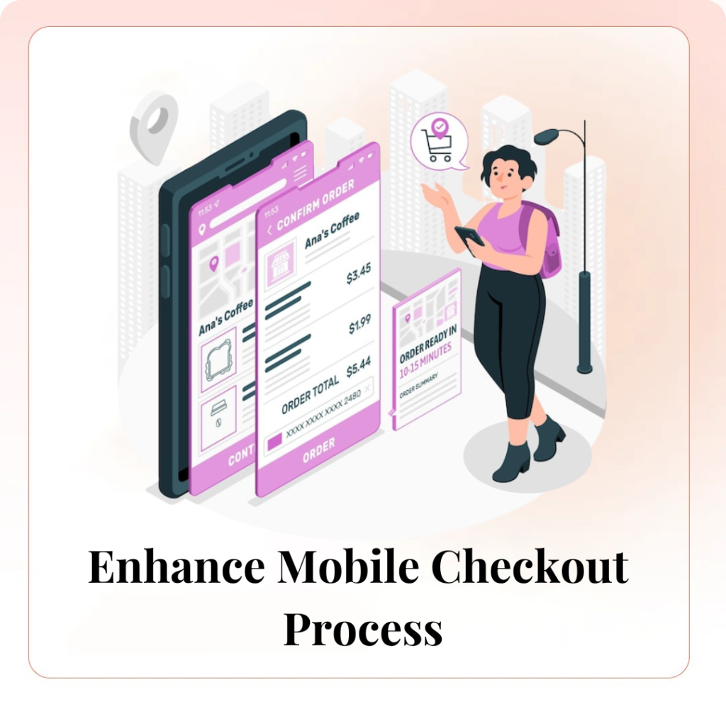
5. Enhance Mobile Checkout Process
A complicated checkout process can deter mobile users from completing their purchases. Simplify the checkout process by minimizing the number of steps and form fields. Offer guest checkout options, enable autofill for address and payment information, and support multiple payment methods, including mobile wallets like Apple Pay and Google Pay.
6. Optimize Images and Videos
High-quality images and videos are essential for showcasing products, but they can slow down your website if not optimized. Use image formats like WebP for better compression without losing quality. Implement lazy loading to defer loading of off-screen images and videos until the user scrolls to them. Ensure videos are responsive and provide captions for accessibility.
7. Use Mobile-Friendly Pop-Ups
While pop-ups can be effective for promotions and lead generation, they can be intrusive on mobile devices. Use mobile-friendly pop-ups that are easy to close and don’t cover the entire screen. Consider timing pop-ups to appear after a user has spent a certain amount of time on your site or scrolled to a specific point.
8. Leverage Accelerated Mobile Pages (AMP)
AMP is a framework that creates fast-loading mobile pages by stripping down unnecessary code and optimizing content. Implementing AMP can improve page load speed and mobile user experience, which can lead to higher engagement and conversion rates. It can also positively impact your site’s search engine rankings, as Google prioritizes AMP pages in mobile search results.
9. Test and Optimize Regularly
Regular testing is crucial to ensure your website performs well on mobile devices. Use tools like Google Mobile-Friendly Test and BrowserStack to check how your site looks and functions on various devices and browsers. Gather user feedback and conduct A/B testing to identify areas for improvement and implement changes based on data-driven insights.
Conclusion
Optimizing your website for mobile sales is essential in today’s mobile-first world. By implementing responsive design, improving page load speed, simplifying navigation, enhancing the mobile checkout process, and regularly testing and optimizing your site, you can provide a seamless and enjoyable shopping experience for your mobile users. Investing in mobile optimization not only boosts sales but also helps build a loyal customer base that returns to your site for future purchases.