In today’s digital era, mobile devices are a primary gateway for online shopping. As the retail industry increasingly moves online, optimizing your website for mobile conversions is crucial. This blog will guide you through effective strategies to enhance your retail website’s mobile performance, ensuring higher engagement and conversion rates.
1. Understand the Mobile User Experience
To optimize for mobile conversions, start by understanding how users interact with your website on their devices. Mobile users tend to have shorter attention spans, so your site must load quickly and present information concisely. Utilize tools like Google Analytics to identify key user behaviors, such as bounce rates, session durations, and conversion paths. This data will provide insights into areas of improvement, helping you refine your mobile strategy.
2. Responsive Design is Key
Responsive design ensures that your website adapts to different screen sizes and devices. A responsive site provides a seamless experience, regardless of whether the user is on a smartphone, tablet, or desktop. Make sure your design elements, such as buttons and menus, are easily clickable and accessible on smaller screens. This improves navigation and reduces friction, encouraging users to complete their purchase.
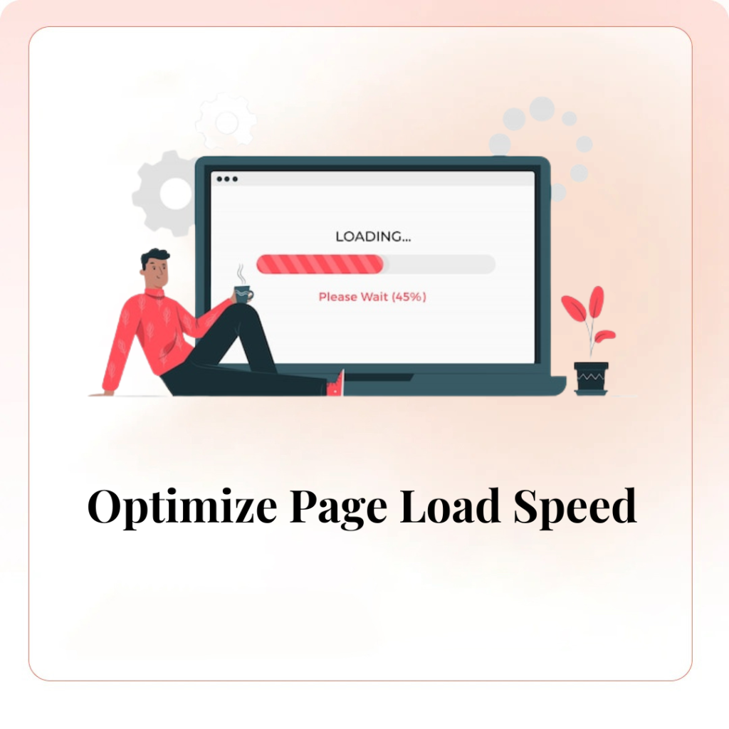
3. Optimize Page Load Speed
Mobile users expect websites to load quickly, and even a one-second delay can lead to significant drop-offs. Optimize your images, minimize redirects, and leverage browser caching to improve page load times. Google’s PageSpeed Insights tool can help you identify and fix performance issues. A faster site not only enhances user experience but also positively impacts your SEO rankings.
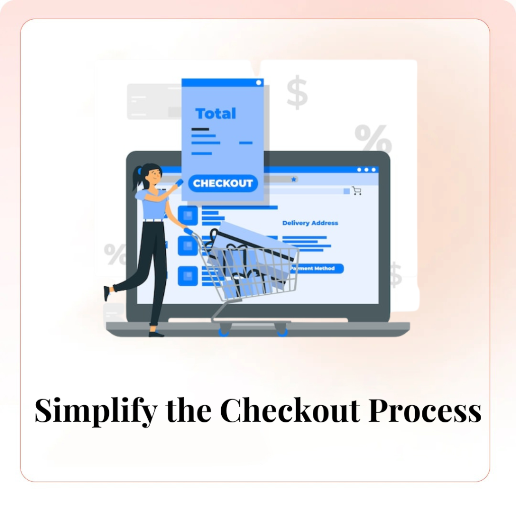
4. Simplify the Checkout Process
A complicated checkout process is one of the biggest barriers to mobile conversions. Streamline the process by reducing the number of form fields, offering guest checkout options, and integrating mobile payment solutions like Apple Pay or Google Wallet. Ensure that your checkout page is optimized for mobile devices, with clear calls-to-action and minimal distractions.
5. Use Clear and Compelling CTAs
Your call-to-action (CTA) buttons should be prominent, clear, and easy to tap on a mobile device. Whether it’s a “Buy Now” or “Add to Cart” button, make sure it’s visually distinct and placed strategically throughout your site. Use action-oriented language that encourages users to take the next step, and test different CTAs to see what resonates best with your audience.
6. Leverage Mobile-Specific Features
Take advantage of mobile-specific features, such as click-to-call buttons, location-based offers, and push notifications. These features can enhance the mobile shopping experience and drive conversions. For example, a click-to-call button allows users to contact customer service with a single tap, providing immediate assistance and reducing abandonment rates.
7. Focus on Visual Content
Mobile users are drawn to visual content, so incorporate high-quality images, videos, and graphics that showcase your products. However, be mindful of load times—optimize your visual content to ensure it doesn’t slow down your site. Consider using carousels or image galleries to allow users to browse multiple products without overwhelming the page.
8. Prioritize SEO for Mobile
Mobile optimization goes hand-in-hand with SEO. Ensure your website is mobile-friendly by using a responsive design, optimizing for page speed, and utilizing structured data. Google’s mobile-first indexing means that the mobile version of your site is prioritized in search rankings, so optimizing for mobile SEO can significantly boost your visibility and traffic.
9. Monitor and Analyze Performance
Finally, regularly monitor your mobile conversion rates and analyze performance metrics. Use tools like Google Analytics and heatmaps to track user interactions and identify pain points. By continuously analyzing data, you can make informed decisions and fine-tune your mobile optimization strategy for better results.
Conclusion
Optimizing your website for mobile conversions in retail is essential for staying competitive in today’s digital marketplace. With the growing use of smartphones for shopping, a mobile-friendly website can significantly boost your conversions and customer satisfaction. By leveraging digital marketing strategies, such as mobile SEO, responsive design, and fast loading speeds, you can ensure that your retail business captures the attention of mobile users and converts them into loyal customers. Embrace the power of digital marketing to enhance your mobile experience, improve customer engagement, and drive sales in the ever-evolving retail landscape.